Erin Shina

Data-driven professional looking for new opportunities to bring value to your business.
Avid reader, musician, and knitter. Ask me about my dog!
View My LinkedIn Profile
Massachusetts Education Analysis

“Education is the key to unlocking the world, a passport to freedom.” ― Oprah Winfrey
My 10-year high school reunion was in 2022. It’s unbelievable to me that it’s been so long, and I’ve been reflecting on my public school experience. I was very lucky to attend good schools throughout my life, and had a lot of priviledge in my educational experience. In a school district as large as JCPS in Louisville, KY, it can be difficult to understand differences in data across schools and understand what it means.
In this project, I used Tableau to analyze and visualize data from another school district in Massachusetts from 2017. The task was to design a dashboard and answer the following for the superintendent:
- Which schools are struggling the most?
- How does class size affect college admission?
- What are the top math schools in the state?
The Data
This data comes from the Massachusetts Department of Education reports from 2017. You can find it here. There are 1,861 rows in the dataset, and relevant columns include:
- class size
- graduation rates
- college attendance
- economic disadvantage
- math test scores for multiple grades
Key Insights
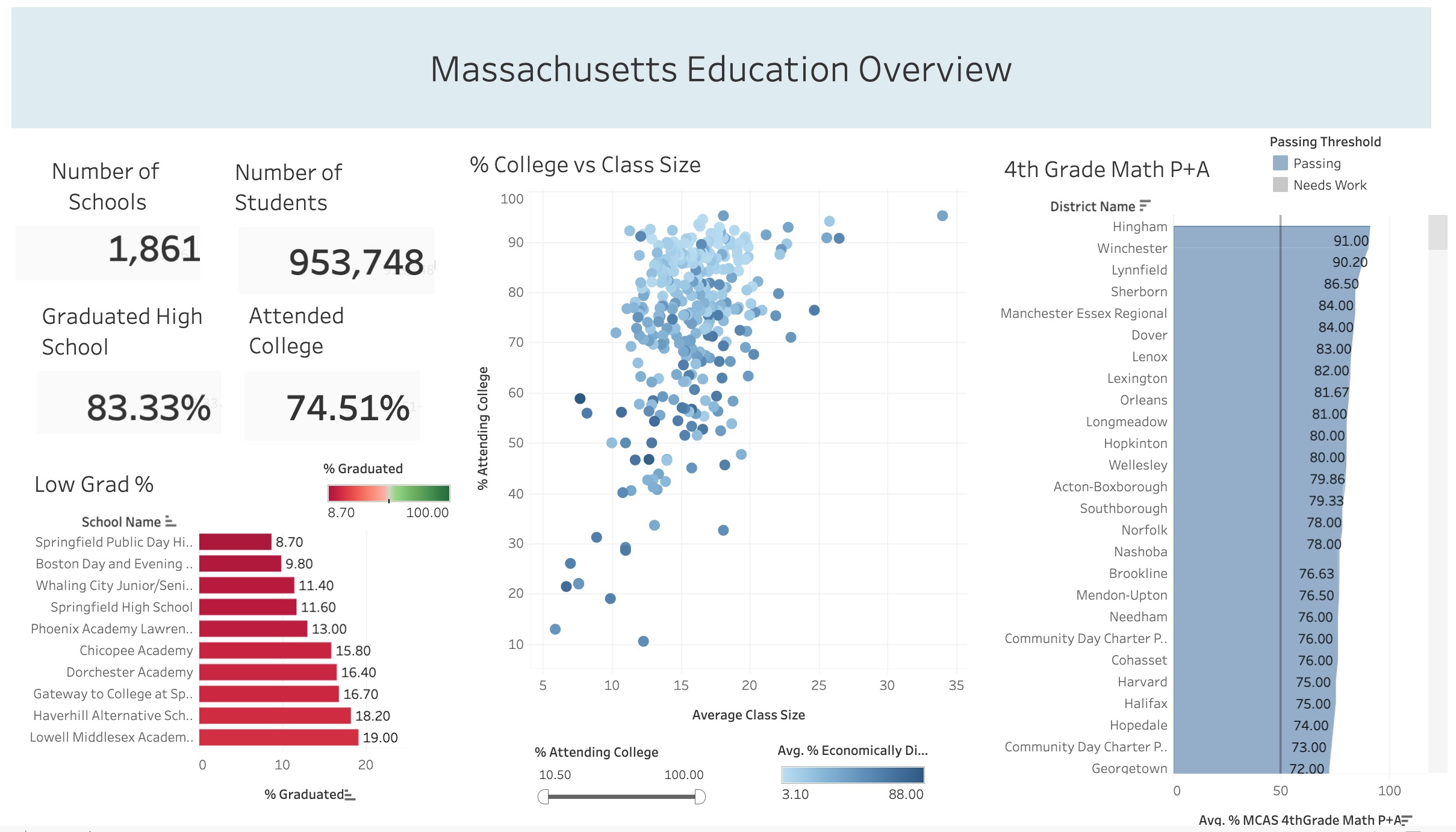
- The lowest-performing high schools have graduation rates less than 20%, though the state average is 83%.
- Class size and college attendance do not appear to be correlated. There is a negative correlation between economic disadvantage and college attendance.
- Massachusetts appears to be preparing students for their state math exams well, with about 75% of 4th graders receiving Proficient or Advanced scores.
Let’s Zoom In
Low-performing Schools
The Secretary of Education in this scenario is interested in which school struggle the most, as indicated by graduation rates. Let’s take a look at what the data says.
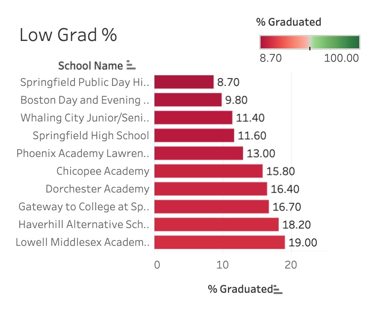
Here we can see the ten schools with the lowest graduation rates, all with under 20% of students graduating. One school, Curtis-Tufts High School, was excluded from this chart - it is an alternative school that provides additional support for students with special needs. Students who attend Curtis-Tufts and are ready to graduate are transitioned to another school during the process, making the graduation rate 0% by design.
Looking further into the schools on this list, we can see that many of them are alternative schools serving various student populations, likely considered “High Need” students. In this data, students fall into the High Need category if they are economically disadvantaged, English language learners, or are disabled requiring an Individualized Education Plan.
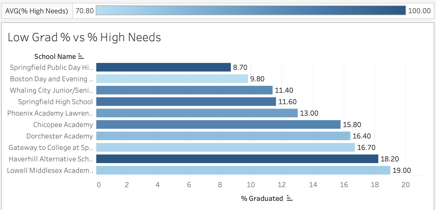
The schools with the lowest graduation rates have 70%-100% high needs students. This warrants additional investigation into the supports provided for students in these schools.
Class Size and College Attendance
A factor often considered when looking at higher education after high school graduation is class size. According to this MA data, there does not appear to be a correlation between the number of students in the classroom and the percentage of students attending college from those schools.
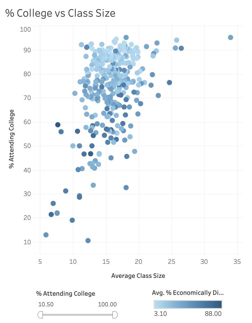
However, we can see a negative correlation between economic disadvange and college attendance - schools with a higher percentage of economically disadvantaged schools see a lower percentage of their students attending college.
Despite the overall trend, there are several schools with a high percentage of students with economic need who also have a high college attendance rate. See the table below:
| School | % Economically Disadvantaged | % Attending College |
|---|---|---|
| City on a Hill Public Charter School | 56.3% | 91.1% |
| New Mission High School | 53.1% | 89.5% |
| MATCH Charter Public School | 56.4% | 90.7% |
Because these schools have “beat the odds” and stand out from the rest of the data, further investigation of their methods and practices may lead to helpful insights for other schools.
4th Grade Math Scores
The Secretary of Education also believes that 4th grade math scores are a key indicator of students’ future success. The Massachusetts Comprehensive Assessment System has four achievement levels to categorize student test results: Advanced (A), Proficient (P), Needs Improvement (I), and Warning (W) for grades 3-8. A and P are considered passing scores, above a 50%.
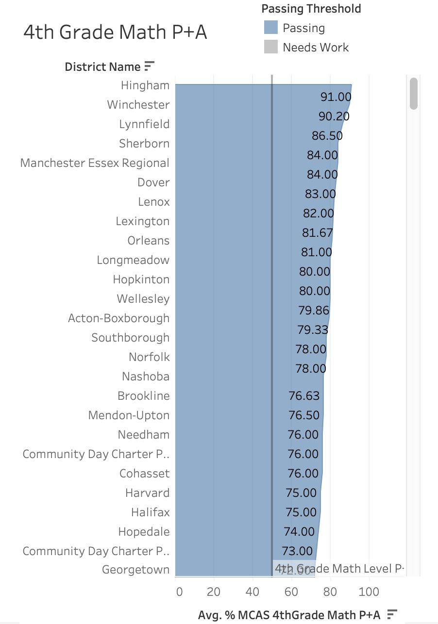
Looking at this chart, and with a little bit of quick math, we can see that about 75% of the schools in MA are preparing their students well for their standardized math assessments. Hingham School District tops the list with 91% of their 4th grade students scoring an A or P in math, closely followed by Winchester with 90.2%. Perhaps math teachers from these districts could hold training sessions for teachers in poorly performing districts.
I compiled all of these visualizations into a dashboard using Tableau, adding in a few additional Key Performance Indicators. Click here. to interact with the data on Tableau Public!
Insights: What’s Next?
- Schools with high population percentages of high-need students tend to have the lowest graduation rates. Further investigation into support needs and action plans for imlpementing that support could raise graduation rates for these schools.
- Though class size does not necessarily predict college attendance rates, schools where economic need is prevelant in the student population tend to have fewer students that attend college. There are several schools that stand out from these trends, and a deeper look at their success could help other schools increase their college attendance rates.
- Massachusetts has done a good job preparing their students for their statewide math assessments, with about 75% of students recieving passing scores. The state should recruit teachers from Hingham and Winchester to train teachers in other districts.
School’s Out
Thank you so much for reading my project. Working with Tableau has been inspiring, and I’m so glad to share what I’m learning with you. I would love any feedback you want to provide. You can reach me at erin.shina@gmail.com, and can connect with me on LinkedIn.
I am currently looking for employment opportunities as a data analyst. I would love to chat if you have anything in your network!